
Goldstar | Rebrand 2025
In 2024, my design team and I were tasked with rebranding our company. Goldstar’s mission was to develop and transition all product offerings to include recycled or sustainably sourced materials and to provide a precise carbon footprint for every product we sell. Leadership provided my team with a brief outlining their vision for how the brand should evolve as the company moved toward its more eco-conscious future.
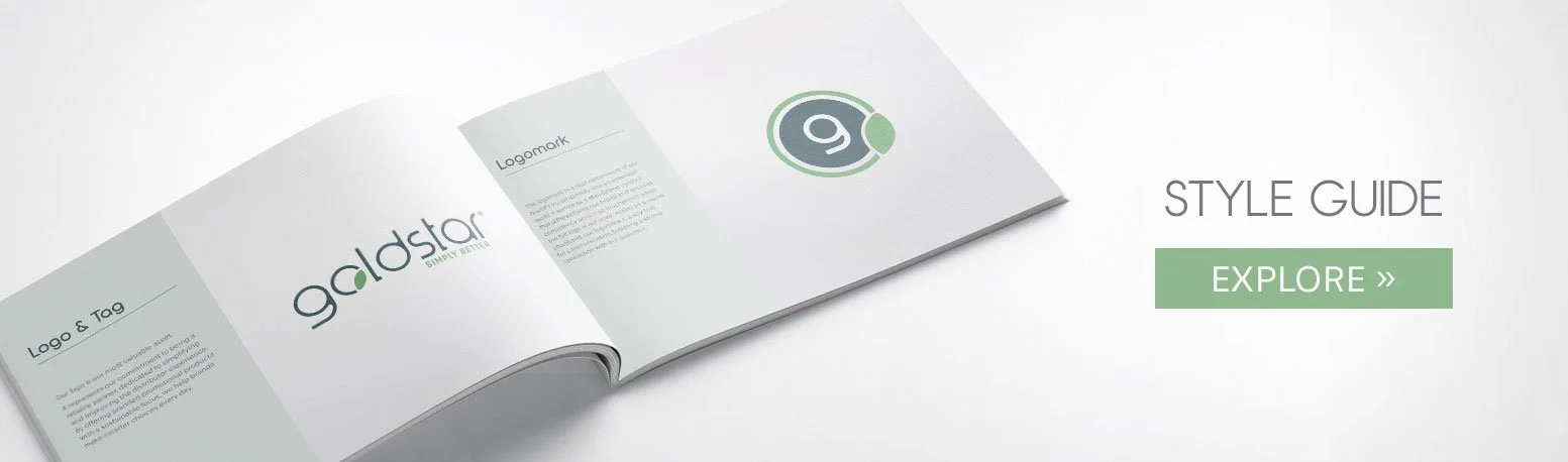
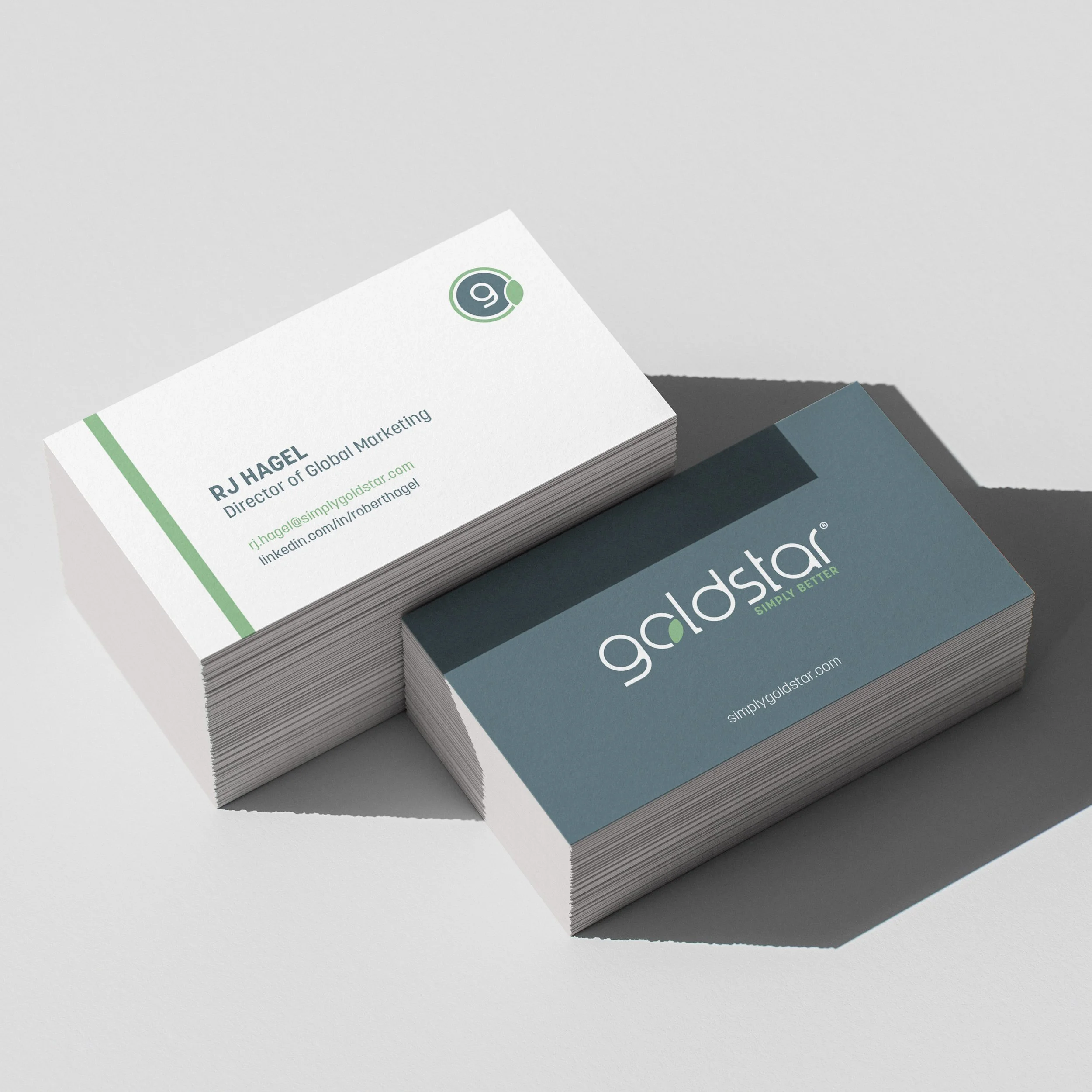
With that direction in mind, my team collaborated to develop a refreshed visual identity—including a new logo and logo mark, brand colors, typography, and an updated visual language—that reflects Goldstar’s commitment to the planet and clearly communicates this mission across the industry.
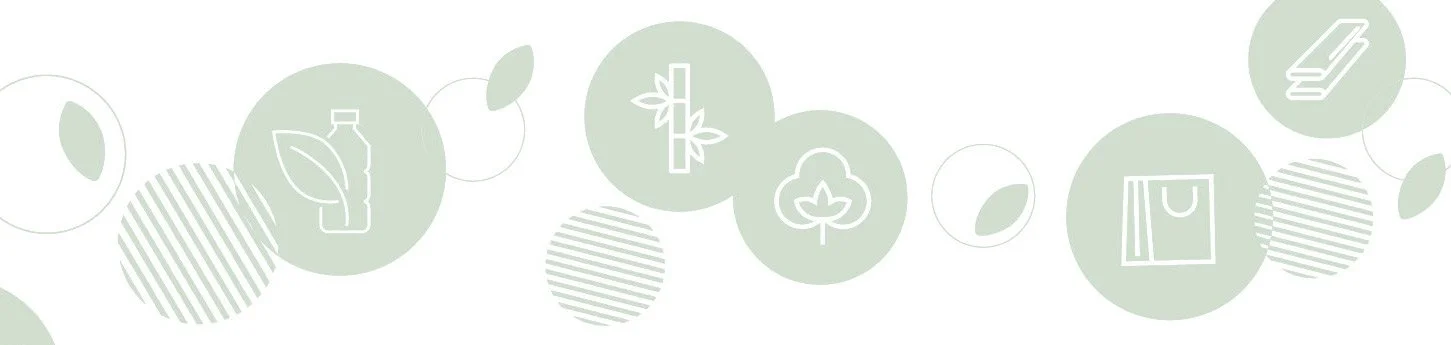
My team and I started by building out the color palette, knowing it would set the tone for everything that followed. The goal was to create a system that felt true to the brand’s mission, but was also flexible enough to work across a range of product lines. It became the first step in shaping our overall visual language. Since sustainability was such a core part of the story, we looked to nature for inspiration—pulling in organic, grounded hues that make that eco-minded focus feel immediate and authentic.
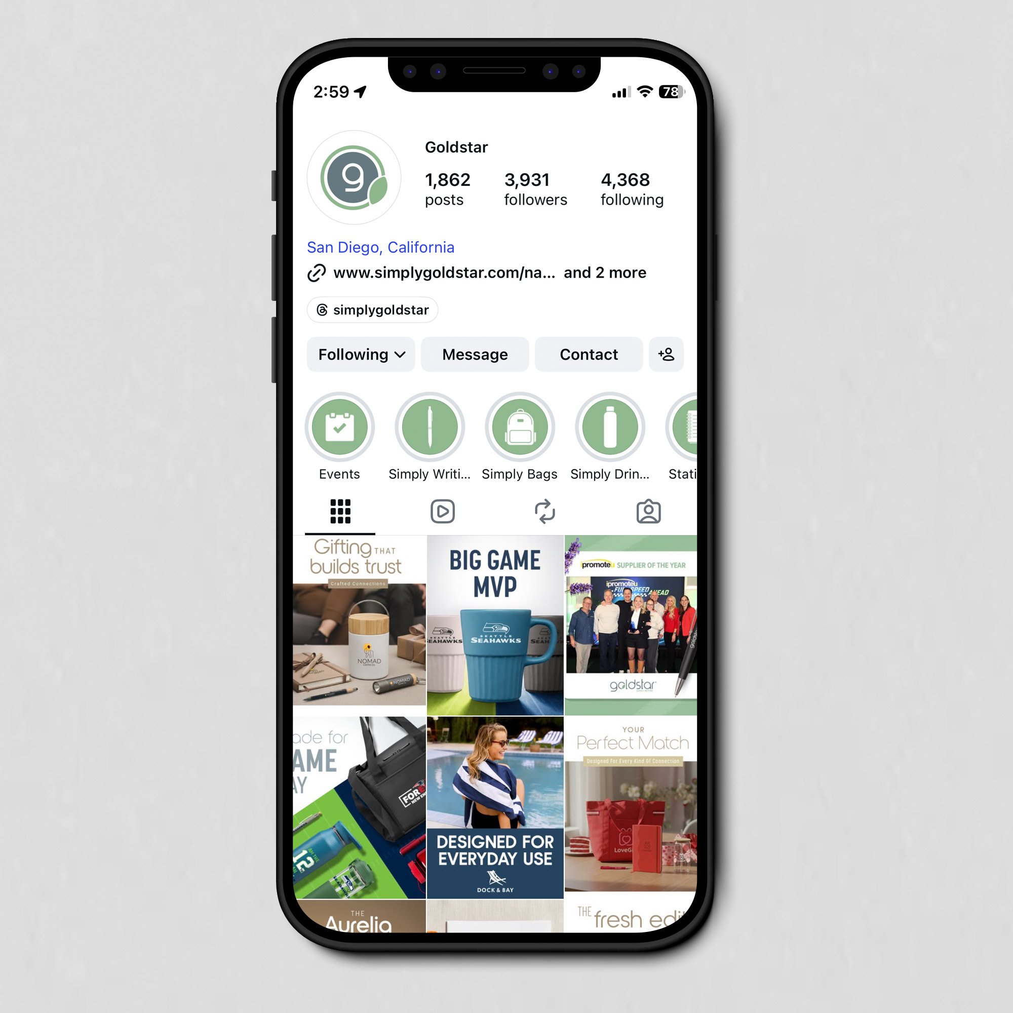
From there, we developed our new brand identity and rolled it out company-wide. We rebuilt our website, social media presence, email campaigns, product flyers, catalogs, email signatures, business cards, and more.
Web Image Updates
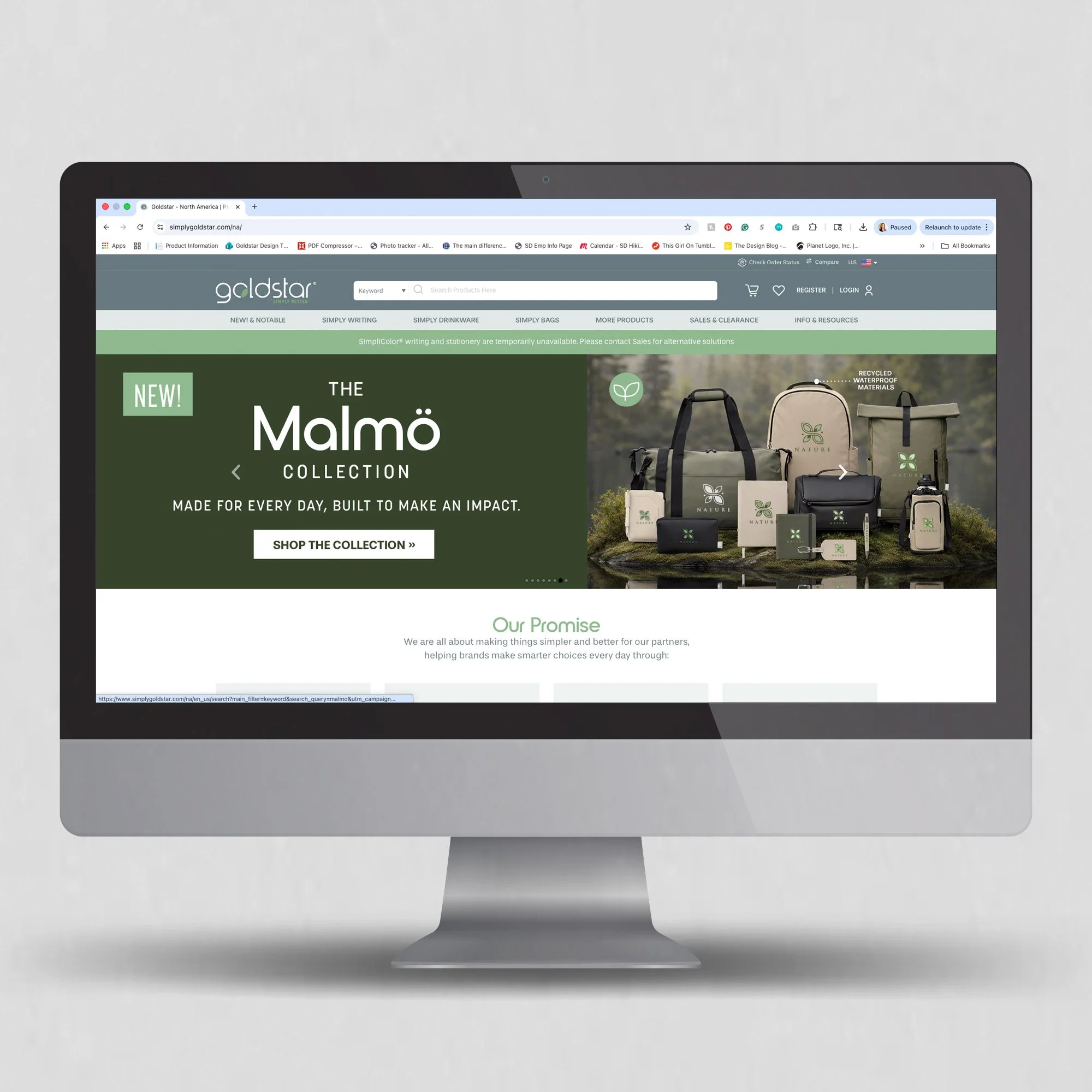
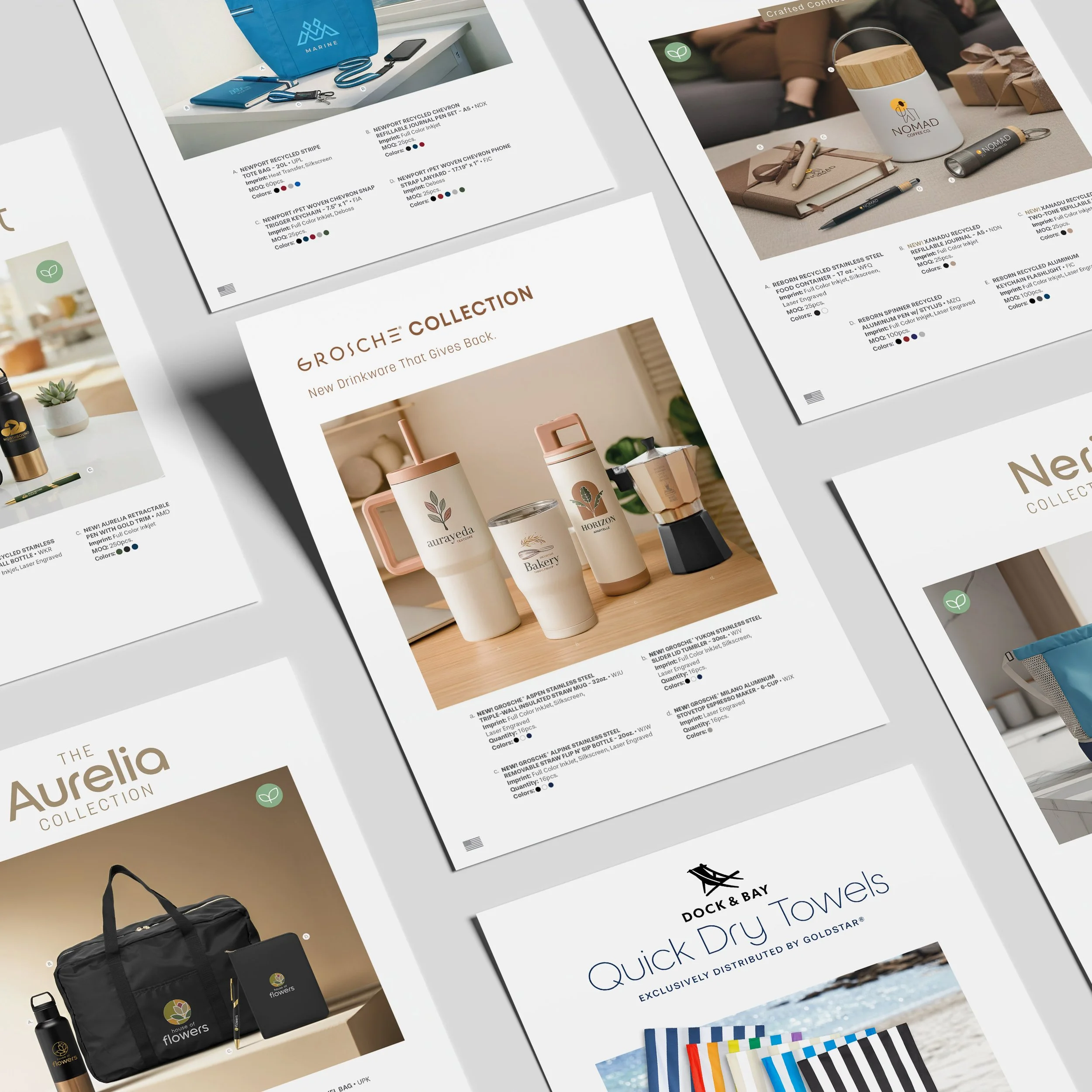
During our rebranding project, I also spearheaded a comprehensive web image update. Understanding that product visuals are often the first interaction customers have with our brand, I wanted to be as proud of our product images as I was of our new brand.
Since these images are so impactful, we aimed to make them look polished, consistent, and retail-ready. Rather than simply being clipped products on a white background, we added a tasteful gray background, grounding shadows, as well as supplemental angles and detail shots.
Collaborating closely with my designers and photographer, we digitally enhanced or reshot each product photo to achieve a more refined and uniform appearance across the entire site.
In total, we refreshed over 10,000 images—completing the project in less than six months and greatly improving the overall customer experience.
AI Lifestyle Image Creation
And because a rebrand rollout and web image overhaul weren’t enough, we, as a design team, also took a step back to rethink how our products were presented in our marketing materials.
As part of our shift toward more eco-minded, “made better” products, we moved away from graphic, vector-based visuals and began placing our products in real-world environments. The goal was to make everything feel more grounded and relatable.
With the help of AI platforms, we created lifelike settings that brought our products to life, giving the imagery a more natural feel and helping customers better visualize how these products fit into their everyday lives.